What was your first impression of Minion Greek? (The original, and the two newer styles)
The first Minion Greek was a very “loaded” project: aside from Gentium, there were no other Unicode-compliant typefaces that covered both monotonic and polytonic, and had a Greek complement that was designed with genuine sensitivity for its balance with the Latin. Many of the design issues were related to the character set, the coordination of the Greek accents, and tuning the design of the secondary styles. In many ways, the first Minion Pro set the reference point for a whole series of subsequent modulated Greek typefaces. In that light, it is perhaps the most fitting typeface to revisit. It marked a significant stage in the course of Greek typeface development, but also carried the signs of its being a very early step in this process.
The twin approach in the new Minion Pro demonstrates in a very straightforward manner that typographic performance relies on the management of white space between and within strokes, whereas style and identity rely on the distribution and modulation of these strokes around the counters and white space. In other words, the overall rhythm (the rate at which black strokes succeed white space along the line) and darkness (the ratio of white to black within the horizontal band occupied by the letterforms) determine a reader’s interpretation of a typeface in terms of width and weight. As long as these are constant, the designer can explore the design space that is determined by the underlying structure of the letterforms, and the stroke modulation. In the case of Minion, the structure comes from the digital interpretations of Robert’s writing pattern, and the modulation of the tool.
A typeface designer examining the two styles in detail will probably see the two approaches as fundamentally different, but zooming out to the perspective of the typographic designer, the differences become more nuanced, and give a more subtle identity to each paragraph, derived from the consistency or variation of the counter space. From this viewpoint, the decision to ship the two styles in the same font file is a message of encouragement to typeface designers to explore the potential inherent in each script, with sensitivity to the details controlled by the typeface designer, but with a deeper appreciation for the frame of mind of the document designer — to whom a typeface like Minion is ultimately accountable to.
Have you encountered Minion Greek in any settings that surprised you over the years?
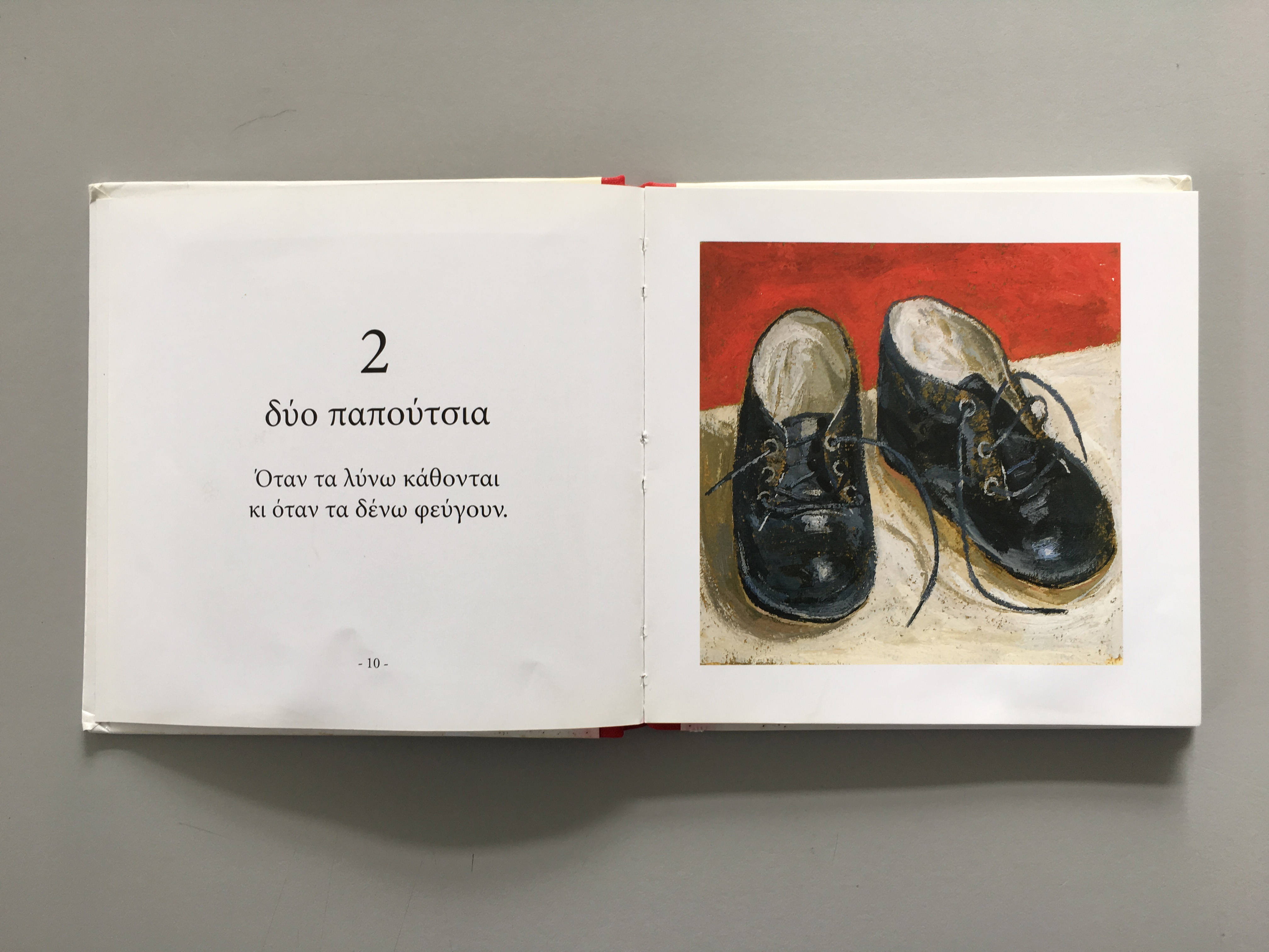
I’ve seen it on anything from long-form fiction to pastry packaging, but my favourite is a series of books for children (or parents reading to children) from 2002 by the artist Fotini Stefanidi (Φωτεινή Στεφανίδη), who illustrated and designed the books; I assumed that the typeface imparted an elegant texture to the short phrases in the spreads.

What was your approach when collaborating with Robert?
Robert does a fair amount of research, so he is familiar with canonical models of Greek typographic forms. His technique often involves writing out letters before digitising them, which helps maintain the connection with the scribal roots of the script. Many of our discussions over the years related to which style of written forms was an appropriate inspiration for each typeface, especially in the italics (for which there were no equivalent Greek styles that could be interpreted as secondary, as is the case with Latin upright and inclined, cursive hands). But he has an excellent understanding of how to build a consistent and fluid texture in Greek, so we were often working on details rather than fundamental decisions. Throughout all our collaborations at the forefront of my mind has been that these are Robert’s typefaces, and I have to give as little as possible steer to the specific forms of the letters — but to give the right kind of information that would allow Robert to make his own interpretations.
Gerry Leonidas teaches and researches typography and typeface design at the University of Reading, UK. He supervises MA and PhD research, and lectures widely. He consults on publication and typeface design, reviews bodies of work, and runs knowledge-transfer projects with a twin focus on global business development, and new education initiatives. He is the president of ATypI, is a founding member of Granshan Foundation, and helps organise ICTVC and other conferences. He is the Director of the MATD, and the TDi summer course; both are global reference points for type education. He just launched the MResTD, a new hybrid MA on research in typeface design.