Minion has undergone changes and expansions since its first release in 1990, and has consistently been regarded as one of Robert Slimbach’s finest designs. Minion is a digital native, designed from scratch as a digital typeface, which grew directly out of Slimbach’s practice of calligraphy and his study of Renaissance text types. Minion 3 builds on this history of typographic excellence and underlying technical sophistication to extend Minion into new areas of potential use.
When Minion was first released in 1990, publisher David Godine, who is known for his fine book work and his classical sensibility, was quoted as calling Minion “an elegant and useful addition to the library of classic typefaces, stronger than Bembo but just as graceful, even in weight and color, with an italic that has genuine personality and sparkle.” In the nearly 30 years since then, Minion’s promise has been fulfilled in a host of books and publications where it has become one of the most elegant of the workhorse text typefaces.
With Minion 3, Slimbach had the opportunity to re-examine the Minion family and to extend it further. He has greatly extended the Latin glyph set, nearly doubling the number of glyphs and covering pretty much any language written in the Latin alphabet, including African languages and Vietnamese, as well as full IPA (International Phonetic Alphabet) support. He has also refined both the Cyrillic and the Greek extensively (even adding a second Greek style), and introduced a new script: Armenian.
Slimbach has also made subtle but significant changes to Minion’s optical sizes, especially the smaller ones. These changes not only improve the appearance and function of Minion for text today, but anticipate the creation of a variable-font version of Minion, where optical sizes will be able to change dynamically and fluidly. Minion 3’s optical sizes extend across the entire typeface — including the Latin, Greek, Cyrillic, Armenian, and IPA scripts.
In an interview with typographer and type historian Robert Bringhurst, Slimbach shares some thoughts on what went into the design of Minion over the years, providing a thoughtful retrospective on his 30-year career and the typeface that’s been with him nearly the whole time.
For Minion 3, Slimbach has created a completely new version of the Greek, giving it the historically accurate reverse pen stress that characterizes written Greek, and adding polytonic letters in addition to monotonic.
Minion’s original Greek, with its more Western directional stress, was released as part of Minion Pro in 2000, and has been used successfully for more than a decade and still works well. Minion 3 offers this original pen stress as a stylistic set. The difference is only in the lowercase, where pen stress is most pronounced; the capitals of both versions are identical. Consultant Gerry Leonidas says that, “in many ways, the first Minion Pro set the reference point for a whole series of subsequent modulated Greek typefaces.”
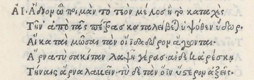
The possibilities in Greek type design have expanded in the ensuing decade and a half, which makes Minion Greek “perhaps the most fitting typeface to revisit,” according to Leonidas. “It marked a significant stage in the course of Greek typeface development, but also carried the signs of its being a very early step in this process.”

In approaching a new version of the Greek lowercase for Minion, Slimbach had to find a way to incorporate the “reversed ductus” – or direction of stress within the letters – that was seen in early Greek types, which derived from the handwriting of Greek scholars during the Italian Renaissance. While keeping the reversed stress, he aimed to achieve “a very pure and principled traditional style, approaching the level of refinement present in the Latin.”
In the revised Cyrillic for Minion 3, Slimbach has given even more emphasis to the broad-edged pen while paying close attention to the balance of proportions — in particular, the tricky optical proportions of Cyrillic’s compound glyphs. The compound glyphs in Minion 3 are a little narrower and lighter than the individual glyphs, so they read like single glyphs rather than like two glyphs combined. This helps to make running text read smoothly and easily. The various optical sizes also add to the subtlety and beauty of Cyrillic typography. Minion 3 also features an extended Cyrillic glyph set, which supports non-Slavic languages that use the Cyrillic script.
As with all of the incarnations of Minion Cyrillic throughout the years, the working designs were reviewed by Cyrillic expert Maxim Zhukov to help identify anomalies that might be present.

In creating Minion Armenian, Slimbach relied on his calligraphic instincts and on extensive research into historical Armenian letter forms. The Armenian alphabet was created 1600 years ago by Mesrop Mashtots (Մեսրոպ Մաշտոց) as a tool for spreading the Christian gospel and for maintaining the identity of the Armenian kingdom in the face of its much larger and more powerful neighbors. The letters of the Armenian alphabet are unique; they don’t share many obvious forms with either Latin or Greek, although some of the styles seen in early Armenian manuscripts seem to echo styles used in Byzantine manuscripts of the same period.
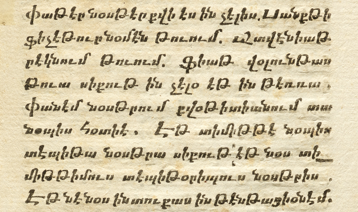
In designing Minion Armenian, Robert Slimbach was trying to imagine what a humanist calligraphic Armenian might look like. The calligraphic heritage of the Armenian script never went through a period like the chancery italics of the Italian Renaissance; and the dramatically revised styles of Armenian created in the 19th century are not calligraphic at all. (The Armenian typefaces created in the early 19th century, which tried to bring Armenian more in line with Latin type design, were strongly influenced by modern styles then dominant in France. Not only did the new typefaces look more like Latin letters, but they echoed the Didot styles used in Paris.) So Slimbach didn’t have many references for how to go about making an Armenian complement to Minion, with its humanist roots.
He began by immersing himself in the history of the Armenian language and its written form. He would stare at examples of traditional handwritten Armenian, then take up his broad-edged pen to write out the letter forms, but in the spirit of humanist calligraphy. As he developed the new forms, he introduced more pronounced handwritten qualities, such as the treatment of half serifs, while still being careful to maintain the essential qualities of Armenian letters. As always when creating a non-Latin complement to a Latin typeface, this involved compromise and balance. In the end, he says, Minion Armenian is even more calligraphic than the Latin; the influence of the pen is even more evident.

Traditional Armenian is often very heavy in weight, pairing a trapezoidal or sawtooth slanted lowercase with large and carefully constructed upright capitals. Modern Armenian fonts typically employ a more internationally accepted Latin form which allows for the adoption of distinct roman and italic styles and weights that are compatible with Western typesetting conventions. In the process of modernizing any individual script, though, Slimbach feels that it is important to retain as much as practically possible of the essential design qualities of the writing system, and the culture that define its character. While Minion Armenian essentially takes on the contemporary oldstyle form of the Latin design, it also exhibits the traditional half-serif or truncated stroke ending along with a slightly heightened calligraphic activity.
Like modern Latin and Greek, Armenian is a bicameral alphabet (having both uppercase and lowercase letters) and its lowercase has many ascenders and descenders. But the proportions are quite different from those of Latin; there is a tradition of very small, angular lowercase letters, with prominent ascenders and descenders, combined with very tall, upright capitals. Because the Armenian lowercase has lots of repeated forms in the x-height zone, the ascenders and descenders become even more important for letter recognition than in the Latin lowercase. For that reason, although Slimbach kept the x-height consistent between the scripts, he made the Armenian ascenders taller and the descenders deeper than their Latin counterparts. Another characteristic of Armenian is that the design of the capital and lowercase forms are more similar to each other than in Latin alphabets. To help better distinguish the caps from the lowercase, Minion’s Armenian capitals are also taller, though not to such a degree that they would be obtrusive in running text. They fit together smoothly in all-caps settings, which have a long history in Armenian typography.
Slimbach consulted initially with the Armenian type designer Edik Ghabuzyan, who had first proposed his own Armenian complement to Minion. After revising and further developing Edik’s design for a time, Slimbach eventually returned to the broad-edged pen to devise a new Armenian — one that embodied more of the character of Minion, and more of the spirit of earlier Armenian book types. While Slimbach felt it was unfortunate to have to abandon many of Ghabuzyan’s design ideas, Slimbach found his insight and perspective invaluable and is grateful to Edik for initiating the extension.
Hrant Papazian, an Armenian American advocate for Armenian type design, was brought in as a consultant later in the process to review and advise on the nearly completed design. Although Papazian made suggestions for specific letterform features, “for example in giving the Armenian «հ» a more authentic form, and correcting what I saw as an unusual style in the descenders with horizontal bars,” he considers Slimbach’s design successfully “Armenian in character.” As the design evolved, Papazian said, “In terms of the overall style of the Armenian, it frankly didn’t change much, and didn’t need to; Robert had already found a solid way to elegantly migrate Minion’s humanism to Armenian.”

The International Phonetic Alphabet (IPA) was developed in order to represent all the sounds of human languages accurately and precisely. That may be an ever-receding ideal, but the IPA gives scholars, linguists, and anyone reading a dictionary a way to read pronunciation when they cannot hear it directly. Since Minion is a typeface often used for multilingual and scholarly work, it made sense to add an IPA complement to the type family. In designing the IPA glyphs with guidance from Denis Jacquerye, Slimbach infused a Renaissance spirit into the forms of this essentially functional linguistic tool.
Robert Slimbach says that of all the faces he’s done, Minion most closely represents his philosophy about type. He feels that type is “a historical entity that arises out of handwriting,” a conjunction of the human mind and a narrow system that reflects the humanity of the people who use type. Type needs to have some organic basis if it’s to function as “a tool for people to relate to, even on an unconscious level.” Minion balances contemporary functional letterforms and “the human lineage of type.”
Next, read about the history behind Minion. Or go and get it.


